Location portraits are a specialty of mine, but as I was covering the Architectural Digest Home Show recently, I came across a frequent problem: how to deal with making interesting portraits in places where you can’t control the light, you don’t have the time or ability to bring in light, and the available light pretty much sucks? And one more thing: I wanted to avoid the obvious trade show shots of people standing in the middle of their booths.
The assignment didn’t include any portraits, but since I was there and the exhibitors were there, I figured I’d do what I normally do anyway. But the lighting in place was designed to light the booths so visitors could see the goods, and not to put a flattering light on anyone in the booths. And the light was pretty much not flattering.
I’d have liked to have put up a light stand and a light, but 1/ I had neither with me 2/ I didn’t have the time and 3/ the people I was shooting didn’t have the time: they were busy trying to sell their goods and meet their potential customers. So I fell back on design.
\

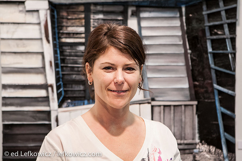
Heather Kocsis makes three-dimensional assemblages of wood which depict urban industrial scenes in great detail. You see her here framed by the entranceway depicted din one of her pieces. I wish the light had been more in front of her so here eyes were in less shadow, but there it was, and I think the framing works.

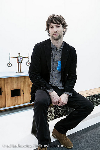
Peter Buley of Analog Modern makes furniture which often incorporates repurposed materials. I wanted to show him in some context, so I asked him to sit at the end of his bench, which has a top made from a repurposed timber, and the legs of steel, inset into the ends of the top. Behind him is a cabinet with doors resawn from a mortised timber. Despite the flat light on his face, seeing him in context makes the portrait work.

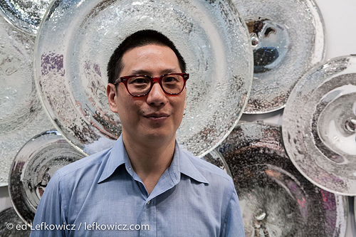
Kanik Chung’s glass is large and dramatic, and I thought the large blown glass plates would make a nice frame for him. I tried a couple up close, and thought about placing him in front of a single disk, but I really liked the effect of the cluster, and was lucky to find a large plate at the right height.

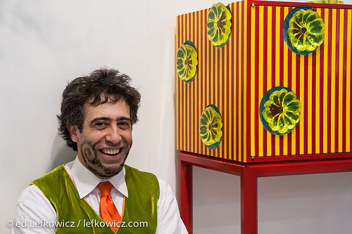
Bart Niswonger is as colorful as his furniture. He’s also a good deal taller than his furniture, so I went with my gut and asked him to sit on the floor next to one of his cabinets. The colors of his vest and tie play nicely with the colors in the cabinet, and that and his obvious sense of humor carried the portrait.
Click this link for my story on “Made” at the Architectural Digest Home Show on Markets of New York.
All shot under show lighting, Canon 5D, 24-70mm f/2.8, ISO 1600. Minor adjustments, mostly color correction and noise reduction, in Lightroom.
